
Sunday, April 29, 2012
Get rid of the line between design and development
Designer and developer Bastian Allgeier says designers should learn how to code to become creatively independent and calls for an end to the strict separation between both skillsets. By .Net Magazine
Nielsen responds to mobile criticism

The usability pro answers critics who have described his recent mobile recommendations as "backward". By .Net Magazine
Nielsen is wrong on mobile
Designer, developer and mobile maven Josh Clark tells us that rather than stripping down, we should be asking how we can do more with the mobile experience. By .Net Magazine
The 10 principles of mobile interface design

Based on his workshops, mobile consultant Jonathan Stark compiles the top principles of mobile interface design and explains how to take your mobile app from concept to completed design. By .Net Magazine
Hillman Curtis, a Pioneer in Web Design, Dies at 51

Hillman Curtis, a former rock musician who became a prominent first-generation Web designer and a visionary figure in the Internet’s evolution from a predominantly text-based medium to the multimedia platform it is today, died on Wednesday at his home in Brooklyn. He was 51. By New York Times
50 fantastic tools for responsive web design

To get started with building a responsive site, having a strong toolkit can make a world of difference. Here Denise Jacobs and Peter Gasston round up 50 great tools to aid the process of making your sites responsive. By .Net Magazine
Ethan Marcotte answers your responsive web design questions

Ethan Marcotte, author of A Book Apart's Responsive Web Design and the man who coined and kickstarted the whole concept, takes on your questions and covers responsive advertising, images and more. By .Net Magazine
15 fabulous responsive sites for your inspiration

Antony and Jerome Ribot present 15 of the best responsive sites featured in our mag's Gallery over the last six months. By .Net Magazine
The next chapter of responsive web design
Responsive web design has been a hot topic for the last couple of years.
And why not? The ingredients of a flexible grid, flexible images and
media queries are a powerful recipe to help us serve websites to screens
of varying sizes. By .Net Magazine
Five responsive web design pitfalls to avoid

There are number of nasty traps to avoid when making your site responsive. Brad Frost of R/GA reveals five of the biggest ones and how to sidestep them. By .Net Magazine
Build a responsive site in a week: going further (part 5)

Although responsive web design can help us craft compelling adaptive experiences, it’s no silver bullet; this approach won’t automatically deliver websites that can cater for every conceivable device and use case – but it’s a start. By .Net Magazine
Saturday, April 28, 2012
Build a responsive site in a week: media queries (part 4)

In the penultimate part of our responsive web design tutorial, Clearleft's Paul Robert Lloyd explains how media queries work, and describes a device-agnostic approach to breakpoints. By .Net Magazine
Build a responsive site in a week: images and video (part 3)

In the third part of responsive web design tutorial, Clearleft’s Paul Robert Lloyd looks at incorporating images and video into responsive layouts, and describes some of the problems in this area that still need solving. By .Net Magazine
Build a responsive site in a week: typography and grids (part 2)
For many years there was a debate among web professionals: fixed or
fluid layouts? In many ways that debate has morphed into one where
responsive layouts (with fluid underpinnings) are matched up against
adaptive layouts (in which fixed layouts replace one another as the
viewport changes). By .Net Magazine
Build a responsive site in a week: designing responsively (part 1)
It seems everyone is talking about responsive web design these days, and
with good reason; as the number of web-enabled devices continues to
grow – each with differing capabilities and features – it’s no longer
sensible to build fixed-width websites. By .Net Magazine
Friday, April 27, 2012
Workflow: the art of getting unstuck
Shift your thinking, alter your process, and create a dynamic of doing
rather than spinning. Kelly Goto discusses feeling "stuck" and how to
get "unstuck" in order to transcend obstacles and develop a culture of
adaptation, progress and flow. By Slideshare
Beyond Usability: Mapping Emotion to Experience

As an evangelist for ‘design ethnography’, Kelly Goto is dedicated to understanding how real people integrate products and services into their daily lives. By Dconstruct
Tools and methodologies for better coding
Optimization and organization can mean many things, but what does it mean to you? By Webdesigner Depot
Why Mobile Web Analytics and not Standard Web Analytics?

The mobile web analytics are meant to study the behavior of various mobile web visitors in a way similar to the desktop web analytics. By Crazyleaf Design
The Future of Web Typography
When a computer displays text, it uses fonts to display different styles of typeface. There are standard fonts such as Arial and Verdana,
however, there are huge lists of fonts available to web developers and
designers which don’t come pre-installed onto your computer, these are
non-standard fonts. By Crazyleaf Design

A Closer Look At Font Rendering

The Web font revolution that started around two years ago has brought up a topic that many of us had merrily ignored for many years: font rendering. The newfound freedom Web fonts are giving us brings along new challenges. Choosing and using a font is not merely a stylistic issue, and it’s worth having a look at how the technology comes into play. By Smashing Magazine
A Pure CSS3 Cycling Slideshow

Thanks to CSS3, we can create effects and animations without using JavaScript, which will facilitate the work of many designers. By Smashing Coding
Gamification And UX: Where Users Win Or Lose

So, what do games have that we miss in UX and Web design? Games have stunning graphics, missions, high scores, etc.. But adding any of those to our designs does not necessarily provide a better user experience — in many cases they’re frippery. What we are really looking for is what those elements bring to the games. By Smashing UX Design

Yahoo!’s Doug Crockford On JavaScript

Douglas Crockford who believes JavaScript might just be the most elegant language ever. Learn why he thinks you should study the history of computer science, the value of reading your code in front of other people, and that jQuery really is a good thing. By Smashing Coding
Content gone wild!
For successful web projects, pay as much attention to the content as to the design and technology. By Slideshare
Representing taxonomies
"Representing Taxonomies: What am I looking at here?" Presentation by
Rachel Lovinger at the 2007 Semantic Technology Conference. By Slideshare
Metadata Workshop
Slides from Rachel Lovinger 'Metadata Workshop' at Content Strategy Applied 2012. By Slideshare
Make your content nimble
Rachel Lovinger's presentation at Confab 2011 about some metadata standards that will help make your content nimble. By Slideshare
The Discipline of Content Strategy
Content strategy plans for the creation, publication, and governance of useful, usable content. By A List Apart
Content Modelling: A Master Skill

A content model documents all the different types of content you will have for a given project. It contains detailed definitions of each content type’s elements and their relationships to each other. By A List Apart
Tinker, Tailor, Content Strategist
A content strategy must achieve a harmonic balance between business goals, editorial mission, user expectations, design vision, the content production process, and technological capabilities. By A List Apart
Wednesday, April 18, 2012
An Event Apart: Content First
In his opening keynote at An Event Apart in Seattle, WA 2012 Jeffrey Zeldman talked about the need to keep content front and center in Web sites and the Web design process. By Luke Wroblewski
For a Future-Friendly Web
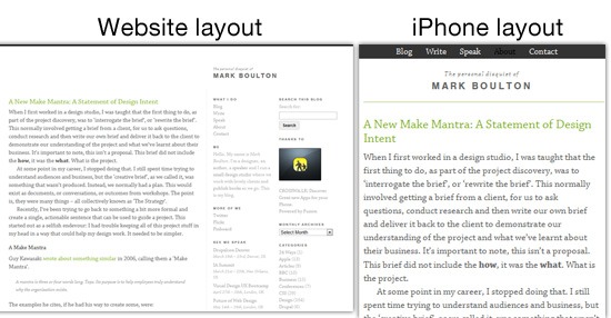
It is time to move toward a future-friendly web. Our current device landscape is a plethora of desktops, laptops, netbooks, tablets, feature phones, smartphones, and more, but this is just the beginning. By A List Apart
Future-Ready Content
From responsive web design to futurefriend.ly thinking, we’re moving quickly toward a web that’s more fluid, less fixed, and more easily accessed on a multitude of devices. By A List Apart
The Web OS is Already Here…

Web technologies are currently powering content and interactions across multiple devices effectively turning the most popular native applications into Web browsers. The end result is a widely distributed and used Web-based operating system. Just not the one you imagined. By Luke Wroblewski
The Art Of Launching An App: A Case Study

You’ve made your first app! Now what? Anyone in the app business knows that marketing an app is tough. By Smashing UX Design
UI Patterns For Mobile Apps: Search, Sort And Filter

Before you ever try to design a search interface for any platform, buy and read these two books: Search Patterns: Design for Discovery by Peter Morville and Jeffery Callender, and Designing Search: UX Strategies for eCommerce Success by Greg Nudelman. By Smashing UX Design
CSS Sprites Revisited
While the theory behind CSS sprites is easy enough and its advantages are clear, they still prove to be too bothersome to implement, especially when time is short and deadlines are looming. By Smashing Coding
Building Emotion Into Your Websites

Emotional design has become a powerful tool in creating exceptional user experiences for websites. However, emotions did not use to play such an important role on the Web. By Smashing UX Design
Beercamp: An Experiment With CSS 3D
If you’re unfamiliar, Beercamp is a party for designers and developers. It’s also a playground for front-end experimentation. By Smashing Coding
Tuesday, April 17, 2012
Speech Bubble User Flow
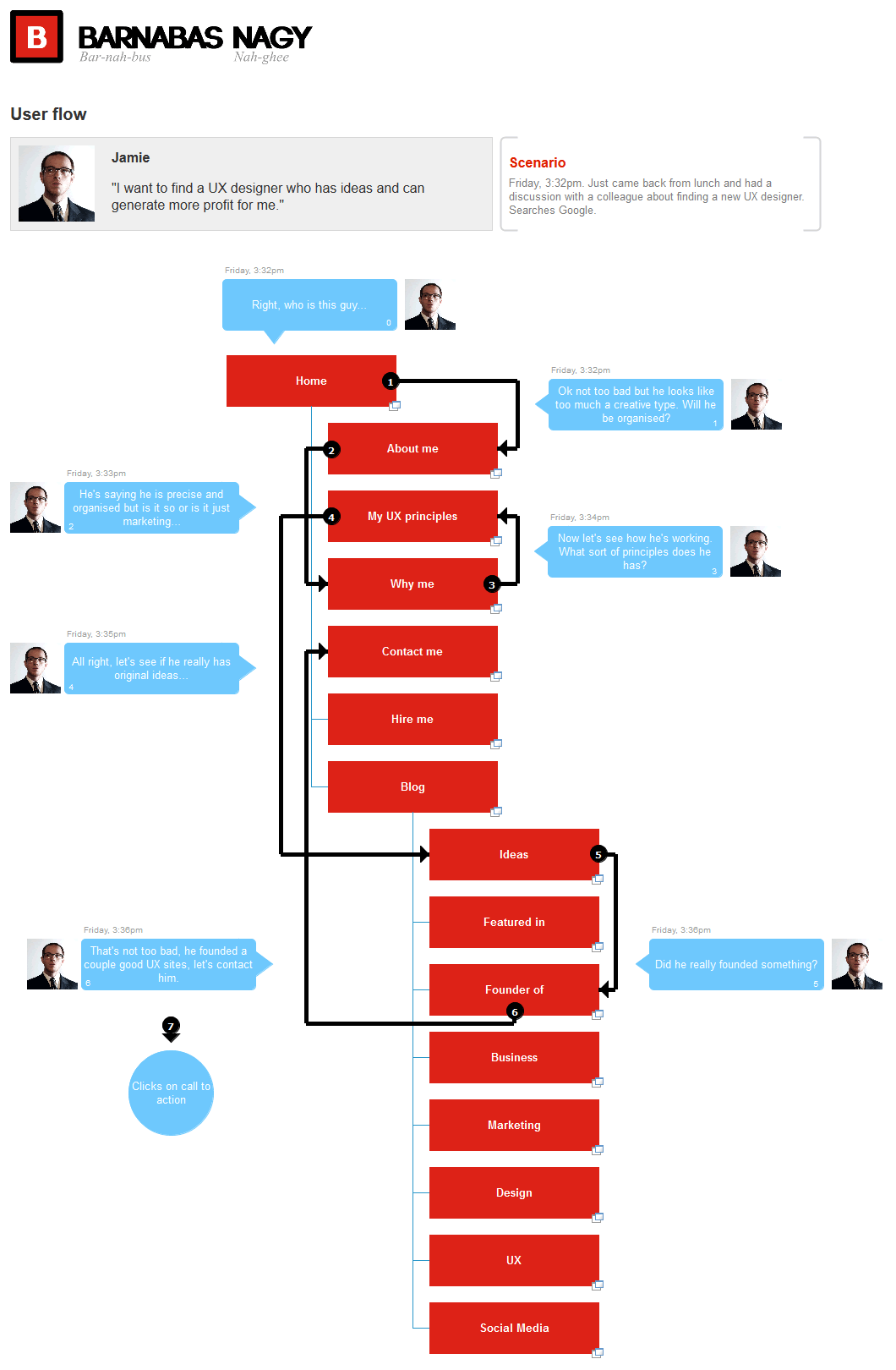
The Speech Bubble User Flow by Barnabas, is a hybrid representation that combines a sitemap, persona and user flow all into one. The idea starts off by overlaying simple and short comments made by a persona in the form speech bubbles on top of a structured sitemap. By Wireframes
Tuesday, April 10, 2012
Guided Tour Through Web Design History

Web design has been with us for a bit longer than 20 years now and sure, it is easy to criticize poorly designed websites nowadays, but few people really know how and where it all started. By 1st Webdesigner
A Handy Guide to Better User Experience
In simplest terms, UX, also known as user experience or user usability is the way most basic users feel about using an application, a program, a website or anything. User Experience is based on the reactions and responses the user performs and provides. By 1st Webdesigner
How To Grow as a Designer by Building Your Own Network

Being part of a web design and development community offers you many possibilities and chances for self-development. By 1st Webdesigner
Cool Tips and Resources to Make Your Website Tablet-Friendly

Is your website ready for the Tablet Revolution? Unless you are one of those Doomsday Preppers and you’ve been living in your bug out bunker for the past few weeks, you know iPad 3 just hit the market, and people are going crazy over it. By 1st Webdesigner
18 Hosted CMS to Solve Your Needs and Grant You Unlimited Jedi Power

When it comes to choosing a CMS, there are a lot of options to choose from. One can go with traditional ones, such as WordPress, Drupal or Joomla! Alternatively, one can opt for a hosted solution too. By 1st Webdesigner
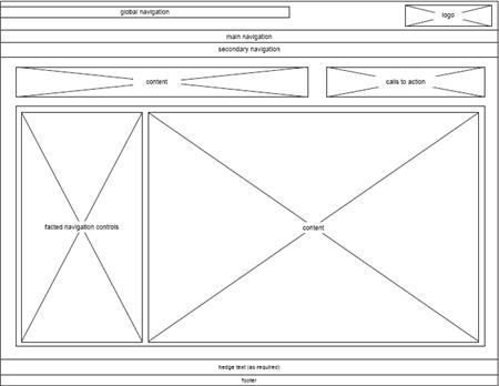
Guide to User Flow – The “Foolishly Ignored” Backbone of Website Design

User Experience, Responsive Web Design and similar terms have made such a serious impact on the lives of web designers that they have almost forgotten the core of website design – User Flow. By 1st Webdesigner
Proper Typography for a Successful Design
Basically, typography is the art and technique of arranging typefaces for
communication purposes. In other words, typography is a simple
arrangement in order to transmit a message, while good typography is the
attention to visual accuracy and details, even the small ones. By 1st Webdesigner
7 Mistakes that Force Potential Clients to Dislike Your Portfolio
A portfolio is a collection of documents, works, progresses and basically everything you’ve done and want to show off. The point of a portfolio is to assist you in the process of presenting your skills, knowledge and experience. By 1st Webdesigner
Mobile UI Design Patterns: 10+ Sites for Inspiration
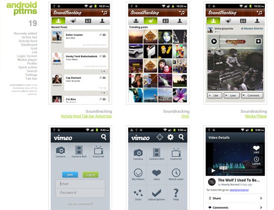
Mobile apps and sites have unique UI design requirements because, compared to their desktop counterparts, they’re used in smaller screens and, at least with today’s modern mobile devices, rely on fingers instead of a keyboard and mouse as input mechanisms. By Six Revisions
“Undesign” Your Portfolio Website
Even the most ineffective, unattractive or simple of man-made objects have been designed in some way. The same is true for the Web: Even the most hideous of websites are created by someone who has consciously made decisions into its design. By Six Revisions
30 Minimalist Portfolio Website Designs for Inspiration
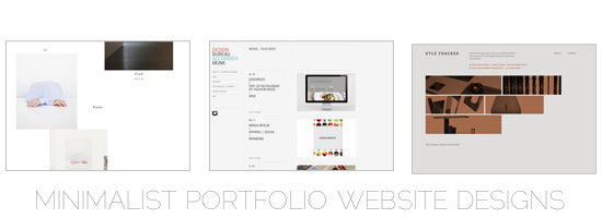
In this showcase, you’ll get to see 30 great examples of minimalist portfolio sites for your inspiration. By Six Revisions
Dive into Responsive Prototyping with Foundation

There are hundreds of devices out there right now that can access the full web, as Steve Jobs once put it. These devices come with different capabilities and constraints, things like input style or screen size, resolution, and form. With all these devices set to overtake traditional computers for web traffic next year we need tools to help us build responsively for these devices. By A List Apart
Organizing Mobile

When it comes to organizing the content and actions on mobile, solid information architecture principles like clear labeling, balanced breadth and depth, and appropriate mental models remain important. But the organization of mobile web experiences also needs to...By A List Apart
Subscribe to:
Posts (Atom)
