
Thursday, January 31, 2013
Dark Footers in Web Design
There are loads of great footer examples in web design. These are some of the most common interface features which you will find on practically every website. Modern designers know which types of content surface well in the footer. You can now design influential areas for page links, credits, website info, and other crucial details. By WDL
16 Inspiring Examples of Interactive Maps in Web Design

21 Fresh Examples of Responsive Web Design

Responsive design is something a lot of designers talk about. And considering the importance of responsiveness and all the buzz around it, it’s impressive the amount of websites that are still not responsive. By now, with the amazing growth of mobile usage, every single website should be responsive to be able to attend to every user’s “screen size needs.” By WDL
Creative Techniques for Single-Page Websites

21 Examples of Dark Colors in Web Design

Choosing the right color scheme for a website is certainly a very important step of a project, specially because colors communicate a lot and will also set the tone, the personality of a page. By WDL
Inspiring Wireframe Sketches

Web Design Trends in 2013

The past few years have seen a tremendous shift in the way developers are building websites. More users have switched onto mobile platforms, along with newer browsers which support HTML5/CSS3 web standards. By WDL
Project Management for Stakeholder Interviews
With good planning, most of your stakeholder interviews should fit within three or four days. Don’t plan on more than six interviews in a day...By Boxes and Arrows
On Alt Text
Any web designer or developer with her heart in the right place knows that, to be accessible, every image requires an alt text. Except when it doesn’t. By A List Apart
Friday, January 18, 2013
44 Exhilarating Dark-Themed Website Designs
There is a lot to consider within this collection, but these examples may provide a spark of creative energy to web designers everywhere. By DesignM.ag
SEO in 2013: The Year of the Consumer

What’s in Store for App Development?

In 2011, there was a lot of innovation in the world of application development on both desktop and mobile platforms. Tablets enjoyed rising popularity, a slew of new app stores populated the Web, and businesses set their sights on using software applications to improve their day-to-day operations. For Web designers and app developers, 2012 offered plenty of opportunity as well. By Helloewy
20 Examples Of Creative Typography In Web Design

Typography is one of the most important aspects of web design. The typography, or style of lettering or numbering used creates a hugely important part of the feel of a webpage. By SLODive
38 Minimalist Layouts Utilizing Excellent Whitespace

The common use of whitespace in web design is an excellent indicator of minimalism. This isn’t to say that all websites using extra whitespace should follow a minimalistic design sense. By DesignM.ag
Strategies for Launching New Websites Quickly & Efficiently

A Comparison of Methods for Building Mobile-Optimized Websites

There’s a debate over which technique of creating mobile-ready websites is the best. By Six Revisions
Best Practices To Increase Your Mobile Commerce Sales
Mobile commerce is changing the way businesses function today. This is not just a random statement but statistics reiterate this point again and again. 64% smartphone users are shopping using their mobile devices. By PixelCrayons
SCRUM: The Story of an Agile Team
You might find the agile process ideal for programming but if you are not developer yourself and just trying to manage projects, whatever they might be, I would recommend the agile process anyway. It is a way of working and it does not really matter what kind of project your work is related to. By Net Tuts+
Understand the Favicon
Since they were first introduced by Internet Explorer in 1999, almost nothing about favicons has changed. By Johnathan Neal
The Importance Of HTML5 Sectioning Elements

Whatever you call them — blocks, boxes, areas, regions — we’ve been dividing our Web pages into visible sections for well over a decade. The problem is, we’ve never had the right tools to do so. By Smashing Magazine

Wednesday, January 16, 2013
20+ HTML5 Tutorials, Resources & Tips

HTML5 offers plenty of potential for web designers and developers, especially when combined with CSS3. The possibilities of HTML5 are exciting, and many designers/developers have been creating amazing things that weren’t possible with HTML and CSS in the past. By Vandelay Design
Preparing Websites For The Unexpected

Designing websites for smartphones is easy compared to retrofitting those already in place. More than that, it’s embarrassing how, almost eight years after CSS gained practical acceptance, a lack of foresight haunts those of us who write HTML. By Smashing Magazine
Tuesday, January 08, 2013
Useful Wireframe Tools for Web Designers

Thursday, January 03, 2013
How To Succeed With Your Mobile App
Most apps fail. This cruel reality has led many disillusioned developers to conclude, often subconsciously, that succeeding on the App Store is like striking it rich in the gold rush: you just need to get lucky. By Smashing Magazine
8 Valuable Practices for Your Mobile E- Commerce Website
New technologies have been introduced for the comfort of online users. This advancement in mobile websites has raised many new challenges also. By Crazyleaf Design
Top 10 Great Photography Websites You Need to Follow as a Photographer

A lot of people are fond of photography, so finding great photography websites for your hobby is a must. Today the high-quality photo cameras are available for everyone who want to take some pictures, no matter are you a photographer or an amateur. By Crazyleaf Design
Organizing Mobile Web Expereinces
The things that make mobile devices unique have a big impact on how we can organize and guide people through the content of our Web experiences. Just making a desktop-based design tiny won’t cut it. Moving your web site to the mobile web makes you step back and rethink.
Watch a video of this presentation at: Extension Learn
Mobile Experience Design Strategy with Luke Wroblewski
Is mobile the next form of mass media? Best-selling author, speaker and mobile project lead, Luke Wroblewski thinks so, and in this video from Cascade SF, he'll talk about what that means and how that impacts mobile UX design.
User Experience Design in the Google Era
NavigationArts' Director of Information Architecture, Kelley McDonald, discusses how to engage site visitors through effective site structure and relevant content.
Testing One Thumb, One Eyeball Mobile Use
People use their smartphones anywhere and everywhere they can, which often means distracted situations that require one-handed use and short bits of partial concentration. By LukeW
Responsive Navigation: Optimizing for Touch Across Devices
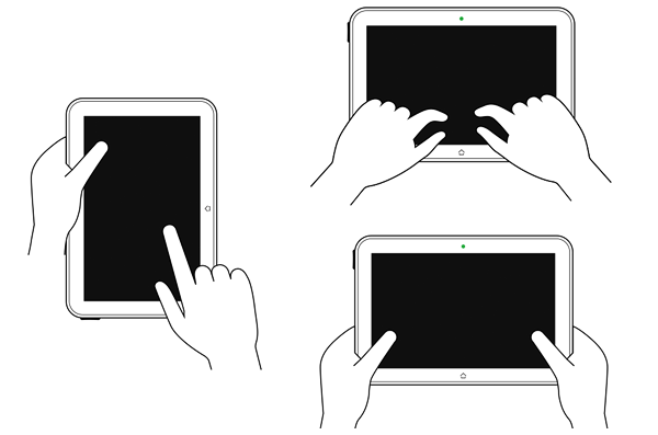
As more diverse devices embrace touch as a primary input method, it may be time to revisit navigation standards on the Web. How can a navigation menu be designed to work across a wide range of touch screen sizes? By LukeW
What Impacts Web Form Conversion?
There are many things you can do to improve the design of Web forms. But what can you do to really boost conversion? By LukeW
Evolving e-commerce checkout
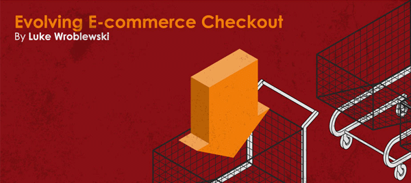
Checkout is the lynchpin of e-commerce. It’s how customers buy and retailers get paid. Yet despite years of evolution, only a few changes have significantly impacted checkout conversion online. By LukeW
Wednesday, January 02, 2013
Design Mistakes We Made in Our iPhone App

Getting things wrong is inevitable when designing a complex user experience like a mobile app. That’s especially true when you’ve never done it before. By Six Revisions
Vexing Viewpoints
“The Web is Agreement.” Jeremy Keith’s eloquent statement neatly summarizes the balance that makes it possible for us to build amazing things. By A List Apart
Tuesday, January 01, 2013
Boost Your Mobile E-Commerce Sales With Mobile Design Patterns


Increasing eCommerce Conversion Rates: Category Page
Content Planning Demystified
The first thing you learn as a junior editor is that you can’t do everything yourself. You must rely on someone else to do at least part of what must be done: the long-range planning, the initial drafting or shooting or recording, the editing, the production, the final polish. By 24 Ways
Subscribe to:
Posts (Atom)
