
Thursday, February 21, 2013
Magazine design principles applied to web design
A lot of principles of magazine design and layout are easily transferred to the world of web design. Some of these are pretty obvious, while you may have overlooked others. But really, it’s all about good design transcending medium. By Web Designer Depot


20 typographic websites

Typography matters, whether it’s used to make reading easy, or whether it’s used to add some decoration. It’s becoming easier and easier, with better technologies, for designers to utilize great typography in their website designs. By Web Designer Depot
How to speed up your website load times
Do you want your website to load blazing fast? This article will teach you how to make your website load faster than you ever thought possible. By Web Designer Depot

What Is Responsive Web Design and What You Should Know About It [Infographic]
The key benefit of a responsive web design over a non-responsive web design is that it can be viewed anywhere, on any device with an internet connection (a laptop, tablet, mobile phone, etc). Thus, if you build a website you’d better make it responsive so it can easily adapt to different screen sizes and therefore be accessible to a wider audience. By Crazy Leaf Design
Understanding Minimalist Website Design

When setting out to create a new website, you have to consider the design style that makes the most sense. Is it for a small business, a band, a non-profit, a special event or something else? Who do you expect to visit your website, and what appeals to them? By Crazy Leaf Design
8 Things to Focus Upon to Create User Friendly Website Navigation

Most of the internet users are losing their patience when they surf in certain websites which offer difficulty of producing relevant information. This is the main problem for most website designer who failed to acquire sufficient traffic. By Crazy Leaf Design
8 Valuable Practices for Your Mobile E- Commerce Website
New technologies have been introduced for the comfort of online users. This advancement in mobile websites has raised many new challenges also. By Crazy Leaf Design
Create 3D clouds in CSS

Sunday, February 17, 2013
Stop designing for screen width, design for content
When choosing your breakpoints, you should always be making your decisions based on where the content breaks and not to device screen widths. Instead of creating a design and then modifying it to fit the iPad screen comfortably, you should find out at what width your content starts to struggle. By Webdesigner Depot
Designing an Open-Source iPhone game

This article is the first in a series that will walk through iOS programming using this game as an example. By Smashing Magazine
Why Responsive web design has to win out


iOS Prototyping With TAP And Adobe Fireworks (Part 1)

One of the strengths of Adobe Fireworks lies in its ability to produce basic-level prototypes in HTML format for the purpose of sharing concepts, evaluating them and conducting usability tests. By Smashing Magazine
Your website has two faces
When a user interface—intended for human consumption—reflects too much of a system’s internals in its design and language, it’s likely to confuse the people who use it. By A List Apart
Tuesday, February 12, 2013
What to expect from a content strategy process
Content strategy is the most important part of your project. It is where you plan what to put into the website, trade publication, brochure, catalog, fifty foot outdoor advertisement, or whatever. By Bio Agency
Monday, February 11, 2013
Responsive Web Design vs Adaptive Web Design

Sunday, February 03, 2013
The Six Inch Gap
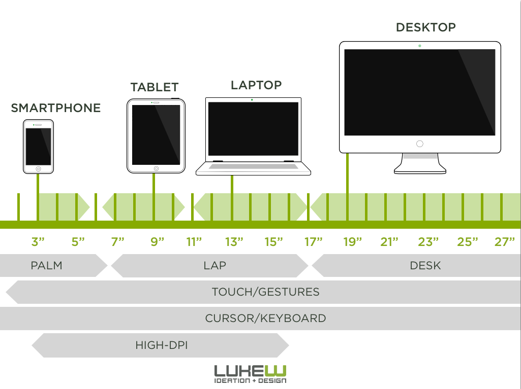
Until recently, modern smartphones stopped short of six inch screens and small tablets began with seven inch screens. This left an odd gap at six inches in today's screen size continuum. Not anymore...By LukeW
Subscribe to:
Posts (Atom)

