

Showing posts with label Web Design and Development. Show all posts
Showing posts with label Web Design and Development. Show all posts
Thursday, February 02, 2012
Responsive Images: How they Almost Worked and What We Need
When Ethan Marcotte coined “responsive web design,” he said that a responsive website is made up of three things: a flexible grid, flexible images and media, and media queries. In doing so, he opened up a world of new and exciting things to obsess over. By A List Apart


Monday, January 30, 2012
Designing The Well-Tempered Web

As technology evolves, so does the art and craft of Web design. New technology creates new challenges, which require new solutions. By Smashing Magazine

Wednesday, January 11, 2012
Responsive Web Design Techniques, Tools and Design Strategies
Responsive design continues to get a lot of attention, but considering how different it is from the “traditional” way of designing websites, it can be a bit overwhelming for those designers who have yet to try it. By Smashing Magazine

Beginner’s Guide to Responsive Web Design

Whether you’re a beginner or a seasoned web professional, creating responsive designs can be confusing at first, mostly because of the radical change in thinking that’s required. As time goes on, responsive web design is drifting away from the pool of passing fads and rapidly entering the realm of standard practice. By Think Vitamin
Web Design Trends in 2012
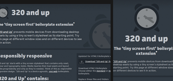
As you read this article, keep in mind that the shift in trends from one year to the next may be subtle, and you will probably recognize some of these trends already. By Web Design Ledger
Subscribe to:
Posts (Atom)

