Friday, November 23, 2012
23 Tips on How to A/B Test Like a Badass
Most marketers and they only have a basic understanding of the art of A/B testing. They haven’t quite figured out how to take it to the next level. By Search Engine Watch
Labels:
a/b testing,
testing
Monday, October 22, 2012
A Field Guide To Mobile App Testing
At the heart of testing is the capability to ask challenging and relevant questions. You are on your way to becoming a good tester if you combine investigative and questioning skills with knowledge of technology and products. By Smashing Mobile
Labels:
app testing,
mobile,
testing
6 Phases of the Web Site Design and Development Process
There are numerous steps in the web site design and development process. From gathering initial information, to the creation of your web site, and finally to maintenance to keep your web site up to date and current. By iDesign Studios
Other tips
Labels:
development process,
process,
web site design
The S.M.A.R.T. User Experience Strategy
It’s not specific, directly measurable, actionable, relevant or trackable. Thus, it will create disagreement and disorganization, sending many projects into chaos. However, you can avoid this by using S.M.A.R.T. goal-setting criteria when defining user and business goals. By Smashing UX Design
Labels:
smart,
user experience,
ux
Tuesday, September 25, 2012
5 Simple Tips for Designing Better iPhone Apps
Since it’s not possible for someone to judge ease-of-use (usability) or code-quality just by browsing the App Store, judging entirely based on design makes sense, and so apps with better design tend to be chosen more often when compared with competing apps. By Nathan Barry
Labels:
app design,
iphone,
wireframe,
wireframing
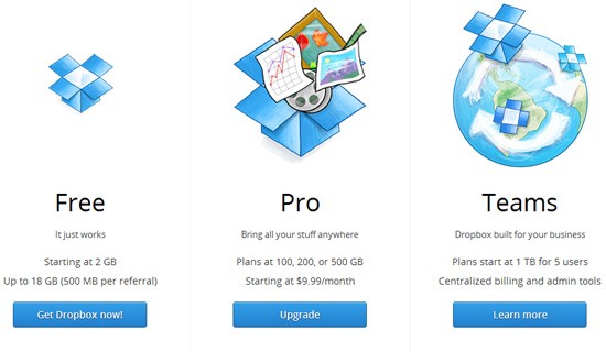
25 Beautiful Examples of Pricing Tables
When a web application or web service has several prices, they’ll often have a pricing page that displays the different plans or subscriptions you can get, typically laid out in a pricing table so that you can easily compare between the differences of each item. By Jacob Gube
Labels:
prices,
pricing table
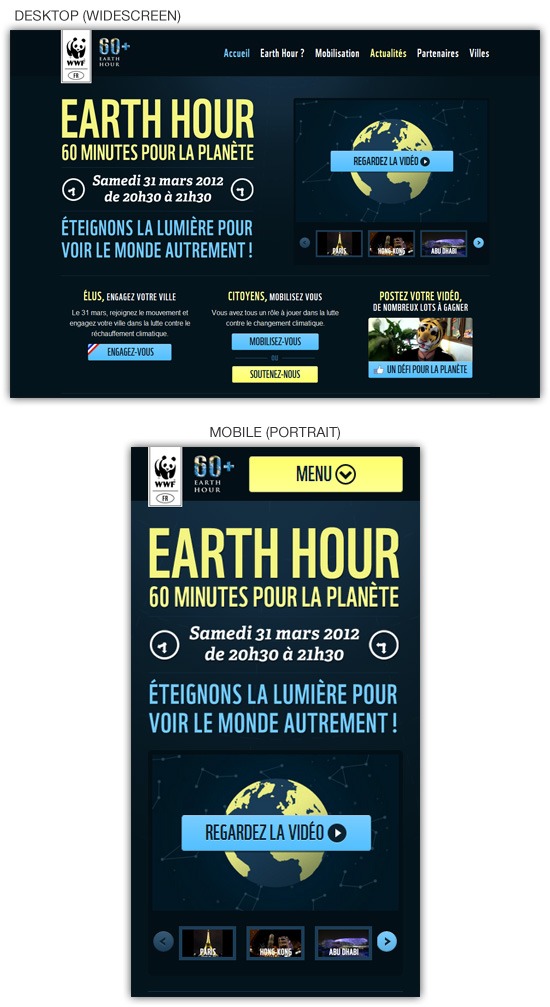
25 Beautiful Responsive Web Design Examples for Inspiration
Responsive web design is the practice of enhancing the experience of the user by adapting the web page layout to the device he or she is using when accessing the site. There are several ways to create a responsive web design, media queries being the standard technique. By Jacob Gube
Labels:
responsive,
responsive design
How to Create Content Maps for Planning Your Website’s Content
Content mapping is a visual technique that will help you organize and understand the content of a website. It can be a simple and valuable part of your site’s overall content strategy. This short and simple guide should help you get started.
Labels:
content,
content mapping,
planning,
website planning
Sunday, July 15, 2012
Helping Your Clients Build an Effective Mobile Strategy
It can be a challenge convincing clients to add new strategies to their existing Web presence. In a perfect world, a client would simply say, "You’re the expert. You know what’s best. Do whatever needs to be done to make it happen!" But, unfortunately, it just doesn’t work like that. By Six Revisions
Labels:
mobile,
mobile strategies,
strategy
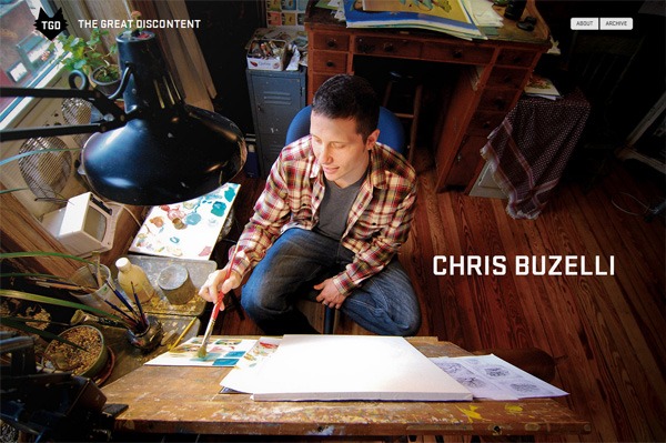
30 Beautiful Dark Website Designs for Inspiration
Using dark colors in your web design can create a look that’s edgy. This showcase features some excellent dark website designs for your inspiration. By Six Revisions
Labels:
black,
dark,
inspiration
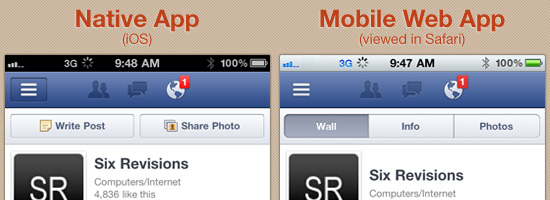
Native App vs. Mobile Web App: A Quick Comparison
A light bulb goes off. You have the next great idea for a mobile app that you want to develop. It’ll change lives. It’ll make you millions. What’s the next step you need to take? By Six Revisions
Labels:
mobile,
mobile web app,
native app
Flow, Mastery and Ease-of-Use
Recently the web design community has been eating up the secrets of game
design. The Gamification trend merely borrowed simple game mechanics,
from badges to progress bars. By Boxes and Arrows
Labels:
ease-of-use,
flow
Monday, June 18, 2012
21 Beautiful Examples of Color Usage in Web Design
From colorful headers to images, textures and typography you will see a lot of different approaches to color usage in web design. By WDL
Labels:
color,
textures,
web design
Tuesday, May 15, 2012
21 Beautiful Examples of Typography in Web Design
Here are some examples of beautiful typography usage in web design. The examples here are where typography is the main focus, and examples where typography complements the design. By WDL
Labels:
typography,
web design
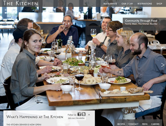
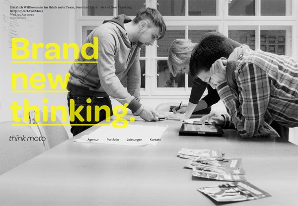
20 Inspiring Examples of Big Backgrounds in Web Design
One way to easily define the tone and mood of a website is to use a big background image. However, when doing this, you need to consider that big images often have a lot going on, so it’s important to take a minimal approach with other aspects of the design. By WDL
Labels:
background,
web design
20 Fresh CSS3 Tutorials
The design industry is probably one of the fastest changing and growing. Designers have to keep their eyes on everything, including new trends in visual design, as well as interaction technologies like jQuery, HTML5, and CSS3. Designers are using these technologies to express more creativity in design production and make user experience richer. By WDL
Labels:
css3
21 Fantastic Examples of Sliders in Web Design
Sliders are an excellent way to organize and highlight important content on a site. They can also be used to display a good amount of content within a limited amount of screen real estate. By WDL
Labels:
content sliders,
sliders
Setting the Bottom Line for your Web Projects
Working as a freelance web designer you’ll find yourself naturally jumping from project-to-project. This quick pace comes with the lifestyle and requires some serious dedication. You cannot get lost in the royalties of extra touch-ups and recoloring textures. By WDL
Labels:
best practices,
freelance,
web designer
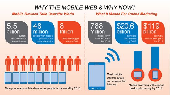
Data Monday: Mobile Web Shopping
Though few people dispute the growth of mobile computing, many remain unconvinced about mobile e-commerce. By LukeW
Labels:
e-commerce,
mobile
Roundup of single page websites
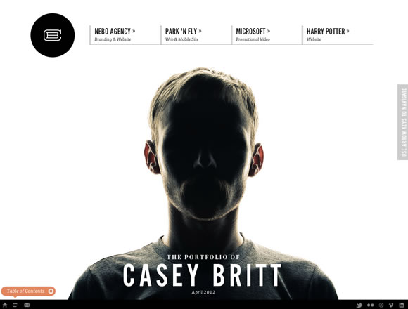
One of the recent developments on the web has been the rise in the use of one page websites by everyone from web designers to large companies to promote their product, app or portfolio. By Webdesigner Depot
Labels:
single,
single web page
A (not so) jilted English professor’s guide to creative web design
Responsive design has some definite buzz of late, and with good reason.
It promises to simplify the increasingly complex task of adapting
websites for the countless new devices multiplying by the minute. By Webdesigner Depot
Labels:
responsive web design
How to speed up your website
Site speed is one of the most important things about creating web content, and web applications.
In fact, it has been noted by various analysts at Google that people don’t often sit through the first 30 seconds of a video, much less the first 15, so it would be wise of you to get the content of your site loaded as fast as you can so that people can make a judgement and agree to either use it or not. By Webdesigner Depot
Posting a price list on your web site: does it work or fail?
Most people misunderstand the concept of a price list for creative services. By Webdesigner Depot
Labels:
price list,
pricing,
web pricing
What’s new for designers
Check out jQuery plugins, grid tools, CSS tools, WordPress resources, productivity and business tools, responsive design resources, and some really great new fonts. Many of the resources below are free or very low cost, and are sure to be useful to a lot of designers and developers out there. By Webdesigner Depot
Creativity-based Research: The Process of Co-Designing with Users
The practice of co-design allows users to become an active part of the creative development of a product by interacting directly with design and research teams. By UX Magazine
Labels:
co-designing,
cognitive
Interaction Design In The Cloud
Interaction designers create wireframes in tools such as Adobe Illustrator, OmniGraffle and Microsoft Visio. Originally, these wireframes were primitive shapes drawn to represent various UI elements. Many of us cannot imagine life without them. By Smashing UX Design
Labels:
Interaction design
Mobile Device Lab, Browsers and Animated GIFs
Short article covering browsers and animated gifs. By Smashing Mgazine
Labels:
animated gifs,
browsers
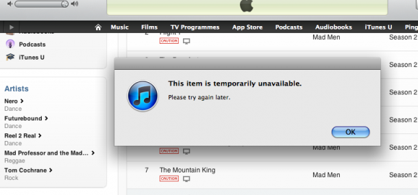
The Importance of Strategic Micro Copy: An iTunes Case Study
Poorly devised, unhelpful content is wasteful. It potentially wastes the time of users and can also have financial implications for the company responsible for it, in this case Apple. By Contentini
Labels:
content,
copy,
micro copy,
strategic
Web Content Strategy: Sites vs Apps
Website content should be easy to read. Your eyes should easily scan through the text and end the article with little effort or eyestrain. By Contentini
Labels:
content,
web content
5 Reasons Why Metaphors Can Improve the User Experience
There are many ways to experience the world around us. Especially offline, we can make use of our different senses to collect information, interpret our environment and make judgments. By Six Revisions
Labels:
metaphors,
user experience
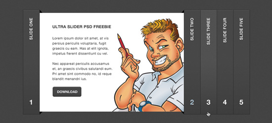
Ultra Sleek Accordion Slider: Free PSD Template
This exclusive freebie on Six Revisions, brought to you by www.bestpsdfreebies.com, is a design mockup of an accordion slider that can be used to display content. By Six Revisions
Hillman Curtis
Hillman passed away at home on April 18th at 6:03 pm in the presence of his loving wife, two children, his sister, sister in law and brother in law. He was 51 years old and died after a long and fiercely fought battle with colon cancer. Hillman deeply loved his work, all of it -- film directing, graphic design, all aspects of new media -- and he especially loved his talented mentors, friends and students in these fields. His favorite topic was inspiration and he made sure to surround himself with it and find it in everything -- his colleagues, his family, New York City, art, film and all of you. He loved you all and took energy from those with whom he corresponded, exchanged ideas and with his fans. Sweet Prince Hill, true gentleman, good dad and passionate artist, Rest in Peace.
Labels:
hillman curtis
Scalable Vector Graphics: an Overview
SVGs are ideal if you require a scalable diagram such as a chart or logo which can be altered or animated using JavaScript DOM methods. By Sitepoint
Labels:
scalable,
scalable vector graphics,
svg
What do you need to know about HTML5 video
HTML5 keeps on stunning the Internet community with revolutionary web features. One of the key HTML5 enhancements is the advanced video support. By Sitepoint
Friday, May 11, 2012
23 Must-Read Tutorials for Advanced HTML5/CSS3 Coders
If you already have a solid grasp on building websites, you may not know where to move next. There are so many topics held under the umbrella of HTML5/CSS3. It’s not possible to learn them all in one sitting! But tons of design blogs these days are writing tutorials geared towards advanced web developers. By Dezineblog
31 Creative User Interface Designs for .org Websites
There are many different organizations which are constantly striving to help the world become a nicer place to live. The Internet is one medium of communication which cannot be ignored in the 21st century. By Dzineblog
Labels:
inspiration,
interface design,
org
34 Top Blogs for Learning Web & Graphics Design
Blogs are the greatest news medium adapted for this new century. With premiere software such as WordPress literally anybody can sit down at their computer as a news reporter to the world. Particularly the topics of web design and Photoshop graphics have become very popular amongst the younger crowd. By Dzineblog
Labels:
blogs,
Graphic Design,
learning wen,
tips
25 Google Chrome Extensions for Web & Graphics Designers
There’s no questioning the popularity of Google. What started as a search engine for the WWW has transformed into an enormous conglomerate media company which has truly changed the way we live. Google Chrome is alternatively a fast-growing browser which trumps Firefox in many regards. By Dzineblog
Labels:
Chrome,
extensions
Guide to Building Semantic Web Forms
In the web design industry there are many different rulebooks you can follow. Most notably the World Wide Web Consortium is renowned for creating these standard rules of the road. Web browsers do not always conform to these standards, thus you have many of the hacks seen today(such as Internet Explorer). By Dzineblog
28 Functional Examples of Web Design Pagination
When sitting down to construct a web layout there are certain elements you must pay attention to. Your header design, logo, and navigation links are just a few to consider. But many web designers don’t spend as much time on pagination effects. By Dzineblog
Labels:
pagination,
web design
Design Tips for iPhone App Website Layouts
The process of designing a landing page is much different than a
standard website. You have to plan ahead for your audience and
understand what they’ll be looking for. These ideas hold true in any
market and certainly within iPhone/iPad app displays. By Dzineblog
Labels:
iphone,
layout,
smart phone
Checking Form Validation Fields with jQuery
There are dozens of misconceptions around what you can build with jQuery. The library is extensible enough that you can target a whole range of HTML elements and perform some very complex data checks. By Dzineblog
Important Features for Ramping Up your Web Presence
Any company can benefit from an improved marketing strategy on the Internet. There are so many outlets for connecting with customers from all around the world that it’s almost impossible to lose traction. But you need to be savvy at understanding trends and how users interact with social networking websites. By Dzineblog
Wednesday, May 09, 2012
Create a Dark Portfolio Web Design in Photoshop
In this web design tutorial, you'll learn how to create a dark web layout in Photoshop. By Design Instruct
Labels:
photoshop,
portfolio,
web portfolios
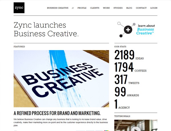
30 Clean Website Designs for Inspiration
Clean web designs — characterized by being aesthetically simple and clutter-free — has become a website design style staple. In this showcase, you’ll find 30 beautiful examples of clean web designs that we hope will surely inspire you. By Design Instruct
Labels:
clean,
inspiration,
minimalist
30 Excellent Textured Website Designs for Inspiration
Applying textures in your design can be an effective way to give it an added bit of intricacy and detail. If you’re thinking of using textures in your website layouts, we hope that these beautiful examples of textured web designs will inspire you. By Design Instruct
Labels:
inspiration,
textured
Using Photo Backgrounds in Web Design: 30 Examples
Using large photos as a web page background is a popular technique that can result in a design that’s vivid and memorable. By Design Instruct
Labels:
inspiration,
photo
30 Beautiful Gray Web Designs for Inspiration
Gray is such a versatile color. Lighter shades of gray can be used to make a web design look elegant, clean and professional. Darker shades of gray can make a web design look bold and edgy. In this showcase, you’ll see 30 beautiful websites that use gray as a principle color. By Design Instruct
Labels:
gray,
inspiration
The Content Strategist as Digital Curator
The term “curate” is the interactive world’s new buzzword. By A List Apart
Labels:
content,
content strategist
Say no to Faux Bold
Browsers can do terrible things to type. If text is styled as bold or italic and the typeface family does not include a bold or italic font, browsers will compensate by trying to create bold and italic styles themselves. By A List Apart
Labels:
browsers,
fonts,
html,
typography,
web fonts
Applying Macrotypography For A More Readable Web Page
Any application of typography can be divided into two arenas: micro and macro. Understanding the difference between the two is especially useful when crafting a reading experience, because it allows the designer to know when to focus on legibility and when to focus on readability. By Smashing Magazine
Labels:
content,
design,
readability,
ux
Removing Stumbling Blocks In Mobile Forms
There are several factors that can be considered to be stumbling blocks throughout the journey of filling out a form. By Smashing UX Design
How To Build A Real-Time Commenting System
The Web has become increasingly interactive over the years. This trend is set to continue with the next generation of applications driven by the real-time Web. Adding real-time functionality to an application can result in a more interactive and engaging user experience. By Smashing Code
Labels:
css,
html5,
javascript
Sunday, April 29, 2012
Get rid of the line between design and development
Designer and developer Bastian Allgeier says designers should learn how to code to become creatively independent and calls for an end to the strict separation between both skillsets. By .Net Magazine
Labels:
best practices,
code,
web designers
Nielsen responds to mobile criticism
The usability pro answers critics who have described his recent mobile recommendations as "backward". By .Net Magazine
Labels:
Jacob Nielsen,
mobile
Nielsen is wrong on mobile
Designer, developer and mobile maven Josh Clark tells us that rather than stripping down, we should be asking how we can do more with the mobile experience. By .Net Magazine
Labels:
Josh Clark,
mobile,
mobile design
The 10 principles of mobile interface design
Based on his workshops, mobile consultant Jonathan Stark compiles the top principles of mobile interface design and explains how to take your mobile app from concept to completed design. By .Net Magazine
Hillman Curtis, a Pioneer in Web Design, Dies at 51
Hillman Curtis, a former rock musician who became a prominent first-generation Web designer and a visionary figure in the Internet’s evolution from a predominantly text-based medium to the multimedia platform it is today, died on Wednesday at his home in Brooklyn. He was 51. By New York Times
Labels:
hillman curtis,
web designer
50 fantastic tools for responsive web design
To get started with building a responsive site, having a strong toolkit can make a world of difference. Here Denise Jacobs and Peter Gasston round up 50 great tools to aid the process of making your sites responsive. By .Net Magazine
Labels:
responsive design,
tools,
web tools
Ethan Marcotte answers your responsive web design questions
Ethan Marcotte, author of A Book Apart's Responsive Web Design and the man who coined and kickstarted the whole concept, takes on your questions and covers responsive advertising, images and more. By .Net Magazine
Labels:
interview,
responsive design
15 fabulous responsive sites for your inspiration
Antony and Jerome Ribot present 15 of the best responsive sites featured in our mag's Gallery over the last six months. By .Net Magazine
Labels:
inspiration,
responsive web design
The next chapter of responsive web design
Responsive web design has been a hot topic for the last couple of years.
And why not? The ingredients of a flexible grid, flexible images and
media queries are a powerful recipe to help us serve websites to screens
of varying sizes. By .Net Magazine
Labels:
responsive design
Five responsive web design pitfalls to avoid
There are number of nasty traps to avoid when making your site responsive. Brad Frost of R/GA reveals five of the biggest ones and how to sidestep them. By .Net Magazine
Labels:
best practices,
responsive design
Build a responsive site in a week: going further (part 5)
Although responsive web design can help us craft compelling adaptive experiences, it’s no silver bullet; this approach won’t automatically deliver websites that can cater for every conceivable device and use case – but it’s a start. By .Net Magazine
Labels:
responsive design
Subscribe to:
Posts (Atom)